3.9 STEREOTYPES RELATED TO NEOCOLONIAL MINDSET

Topic
Materials

Our tendency to place concepts, knowledge and aspects of reality into pre-defined boxes leads us to take many things for granted and to accept them without reflecting. 

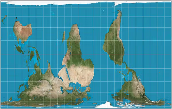
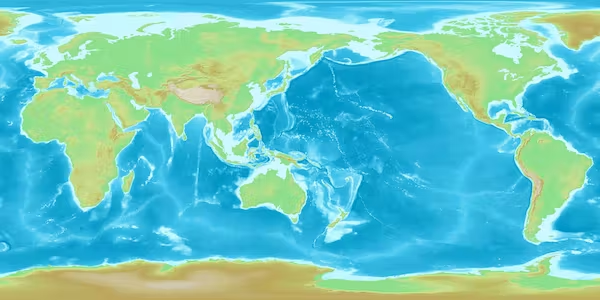
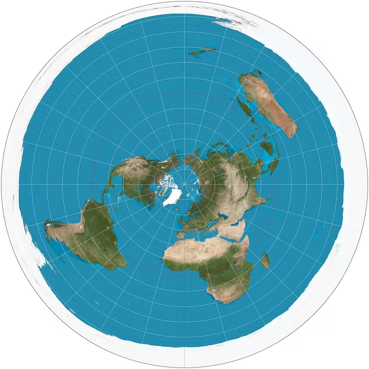
The way we see our world is a typical example of this process.  Look at these 5 maps:


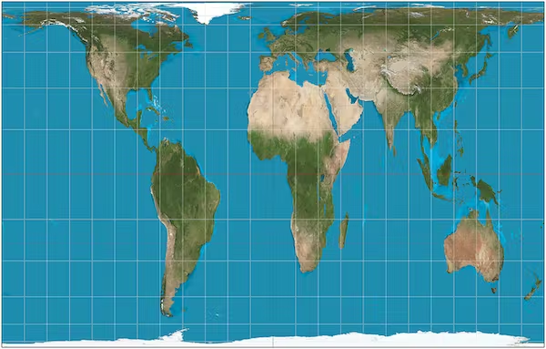
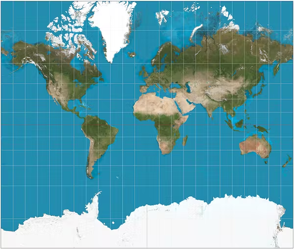
Mercator Projection

This is the more commonly used one. It exaggerates the size of the Earth around the poles and shrinks it around the equator. 

So the developed “global North” appears bigger than reality, and equatorial regions, which tend to be less developed, appear smaller. 

Why does this problem occur? Simply put, the world is round and a map is flat. Imagine drawing a world map on an orange, peeling the skin to leave a single piece and then flattening it. 


Peters projection

The Peters projection accurately shows different countries’ relative sizes. 

Although it distorts countries’ shapes, this way of drawing a world map avoids exaggerating the size of developed nations in Europe and North America and reducing the size of less developed countries in Asia, Africa and South America.


South-Up projection

North is up, right? Only by convention. 

There’s no scientific reason why north is any more up than south. Equally, we could do east-up, west-up or any other compass bearing. Purposefully reversing the typical way world maps are drawn has a similar political effect to using the Peters projection, putting more developing countries in the generally poorer southern hemisphere at the top of the map and so giving them greater significance.


Pacific-centre projection

Another convention of world maps is that they are centred on the prime meridian, or zero degrees longitude (east-west). 

But this is scientifically arbitrary, deriving from the location of the Royal Observatory in Greenwich, London.


Azimuthal equidistant projection 

An alternative to the above mentioned projection  is to place the North Pole in the centre. It is strangely disorienting to gaze on the world from a polar perspective. The lower hemisphere should be hidden from view by the curve of the Earth because you can only see half a sphere at a time.

But on the azimuthal polar projection from the north, the southern hemisphere has been pulled into view on the page, with the consequence that Antarctica centrifuges into a doughnut around the edge of the circular map.


TIME TO REFLECT

Why do you think the world map was originally made this way?

Why do we still use the Mercator projection? 

What does it show about world relations? 

Share your thoughts in the comments!

TO KNOW MORE

Read this article about Mercator map and teaching geography in schools

https://www.globalcitizen.org/en/content/world-map-wrong-mercator-peters-projection-boston/

Change your point of view! Now that you know all countries are not well scaled on the Mercator map. Click here to find out how big your country is in comparison: https://www.thetruesize.com/#?borders=1~!MTY4MjA1MjE.MTk1MDIyMg*MzYwMDAwMDA